

As a web designer or online training developer, you must have heard about the importance of responsive eLearning design. With the rise of mobile devices and different screen sizes, creating courses that adapt to the device they’re viewed on is essential. In this blog post, we’ll investigate the significance of responsive eLearning design in today’s multi-device world and how to create courses that can adapt for optimal learning experiences.
To create a seamless learning experience, we’ll discuss designing responsive e-learning courses that adjust to any device used. We will also discuss some best practices for designing scrolling pages and dealing with multiple devices.
You’ll learn how to enhance the user experience by optimizing your course content for various screen sizes without compromising quality. By adopting these techniques, you can ensure that learners can access your online training from anywhere at any time while enjoying seamless navigation across their preferred devices.
In summary, this blog post aims to equip you with everything you need to know about creating effective, responsive e-learning courses that cater perfectly to our multi-device world. Let’s get started!
Table of Contents:
- Importance of Responsive eLearning
- Best Screen Size for eLearning
- Implementing Responsive Design in E-Learning Courses
- Rise – A New Way of Building Interactive Slideshows
- Microlearning – Short Bursts of Information
- Feedback – A Key Component for Responsive E-Learning Courses
- FAQs about Responsive Elearning
- Conclusion
Importance of Responsive eLearning
Responsive eLearning is essential for modern education, allowing learners to access courses on multiple devices and operating systems. By using a responsive design, content can be optimized for different screen sizes and adapted to the device being used by the learner. No matter the device or location, learners can easily access and interact with content due to a consistent design tailored for multiple screens.
In addition to this, responsive design helps create an optimal user experience. Learners can easily navigate courses without having to zoom in or out constantly due to differences in resolution between devices. In addition, learners can be certain that accessing material from multiple operating systems like iOS and Android won’t cause compatibility issues. As a result, learners are more likely to stay engaged with the course longer since they don’t have any technical difficulties getting in their way.
When designing eLearning courses with responsiveness in mind, developers must take several factors into account, such as recommended screen sizes for desktops, laptops, tablets and smartphones; statistics indicating which device types students prefer while taking online courses; tips to ensure simple navigation; how tagging techniques can be utilized effectively; advantages of utilizing open-source software over proprietary solutions etcetera. All these components combine to create a unified experience that guarantees each student receives the best possible learning experience regardless of what type of device they’re using – desktop computers at home or office spaces during work hours. Tablets while commuting? Or even smartphones while waiting in line at Starbucks. With this holistic approach, learners are bound to stay engaged with the course longer since they won’t face any technical difficulties.
Responsive eLearning is essential for providing an optimal learning experience across all devices, as it ensures content and activities are displayed correctly regardless of the device used. Understanding the best screen size for eLearning is critical to ensure learners have a positive online course experience.
Key Takeaway: Responsive eLearning design ensures learners can access courses on multiple devices and operating systems, creating an optimal user experience without compatibility issues. By taking into account screen sizes, device preferences, and open-source software, developers can provide a unified learning experience for all students so they don’t face any technical difficulties getting in their way.
Best Screen Size for eLearning
Choosing the right screen size is essential when creating an effective e-learning course. Experts recommend desktop computers, laptops, tablets and smartphones as the best devices for optimal learning experiences. Studies show that students prefer specific device types while taking online courses; tablets are used more often than desktops or laptops for completing assignments and tasks.
When designing a responsive e-learning course, it’s important to keep navigation simple. Tagging techniques can organize content more efficiently across multiple devices so users have a consistent experience regardless of their device. Open-source software such as Adapt provides developers with powerful tools to create responsive e-learning courses quickly and easily without relying on proprietary solutions.
In conclusion, the best screen size for eLearning depends on the device type used by students and should be considered when designing courses. To ensure a smooth learning experience, implementing responsive design in e-learning courses is essential to keep navigation simple and content organized efficiently.
Key Takeaway: When designing an effective e-learning course, it is crucial to consider the user’s device type and ensure a seamless experience across multiple devices. To do this, developers can utilize tagging techniques and open-source software such as Adapt, enabling them to create responsive courses with ease – like a walk in the park.
Implementing Responsive Design in E-Learning Courses
Responsive design is a must-have for any eLearning course. Responsive design guarantees that your eLearning content is displayed optimally and operates correctly on all devices, from laptops to tablets and mobile phones. When utilizing responsive design in your courses, it’s essential to keep navigation easy and intuitive so users can quickly locate what they need. Tagging techniques can also organize content more efficiently across multiple devices.
Open-source software such as Adapt offers many advantages over proprietary solutions when creating a responsive eLearning experience. This platform uses deep vertical scrolling pages instead of traditional slideshows, which allows mobile users to view the same information without feeling overwhelmed by too much content on their device screen size. Adapt allows for the construction of an engaging learning atmosphere, with interactive components such as videos, pictures, audio clips and quizzes that accommodate various device sizes used by students during their online classes.
By implementing responsive design in e-learning courses, instructional designers can ensure learners have a consistent and optimal experience regardless of their device. Additionally, rise provides an innovative way to easily create interactive slideshows – allowing for more engaging content creation.“Make sure your #eLearning courses are optimized for all devices with responsive design. Open source software like Adapt makes creating an immersive experience that works across all device sizes easily.” #ResponsiveDesign #TrainingClick to Tweet
Rise – A New Way of Building Interactive Slideshows
Rise is a revolutionary application designed to help instructional designers and developers create interactive slideshows that are device-agnostic, meaning they can be used on any device without adjusting the layout or content. This makes it easier for learners to access the same course material regardless of their device – desktop computers, laptops, tablets, or smartphones. Rise’s intuitive drag-and-drop interface enables users to quickly assemble multimedia elements such as images, videos, audio clips and quizzes into engaging experiences four times faster than traditional methods.
Responsive design plays an important role in ensuring learning courses look great across multiple devices. Rise provides web designers with the flexibility needed to create mobile user experiences tailored for each platform. With tagging techniques like those used in HTML5 development projects, rise allows users to organize their content more efficiently by grouping related items. Hence, they appear together when viewed on different devices. Additionally, since Rise is open-source software, there are no licensing fees associated with using it, making it an attractive alternative over proprietary solutions that require hefty upfront investments before you can even start creating your course.
Overall, rise offers a new way of building interactive slideshows that provide learners with a more immersive experience while giving instructional designers greater control over how their content looks across all platforms. By combining responsive design principles with cutting-edge technology, such as tagging techniques and open-source software, we now have the tools to build truly engaging eLearning courses at lightning speed.
Rise offers an innovative approach to creating interactive slideshows that are easily accessible and highly engaging. By using microlearning modules, instructional designers can deliver concise information in a way that is both effective and efficient for learners.
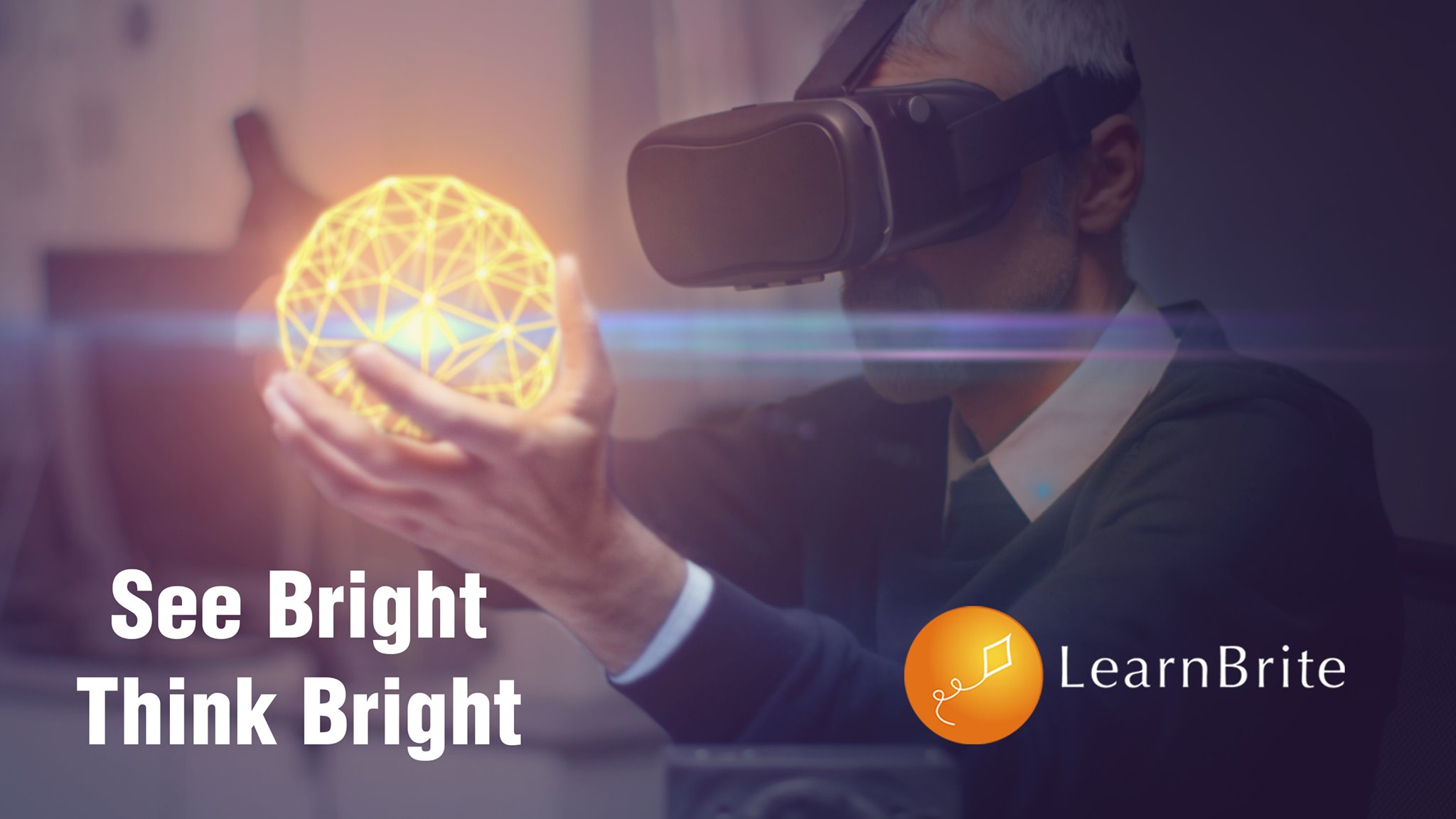
LearnBrite makes it easy for anyone to create immersive and engaging micro-learning and instructor-led training scenarios without coding skills. With LearnBrite’s platform, you can bring your training to life in just minutes, using immersive branching scenarios that can be accessed on any device, including mobile, tablet, desktop, and even VR/AR. Best of all, you don’t need to write a single line of code. This means you can focus on creating dynamic and effective learning experiences while letting LearnBrite take care of the technical details.
Key Takeaway: Rise gives instructional designers and developers the power to create interactive, device-agnostic slideshows in a flash using its intuitive drag-and-drop interface. Responsive design principles combined with advanced tagging techniques give users unprecedented control over their content, allowing them to craft engaging eLearning experiences quickly and cost effectively.
Microlearning – Short Bursts of Information
Microlearning offers an effective way to deliver content in concise, bite-sized pieces which learners can quickly understand. It offers several advantages over traditional methods of e-learning, such as increased engagement and better retention of information. By breaking down complex topics into smaller, more manageable pieces, microlearning makes it easier for students to focus on the most important aspects of the material. Additionally, its use of multimedia elements such as videos and animations makes it an ideal choice for creating engaging experiences that keep learners engaged throughout the course.
Microlearning can be successful by dividing substantial material into understandable and retrievable pieces. For example, instead of presenting a long lecture on customer service skills, instructors can create multiple modules with shorter video clips or interactive activities focusing on specific topics within customer service, such as active listening or problem-solving techniques. This approach allows learners to grasp concepts quickly without feeling overwhelmed by too much information at once.
Microlearning encourages collaboration between students who may have been previously limited due to physical or language barriers, time constraints, etc., thus allowing them to engage in comments and feedback threads related to the course material for better understanding. By allowing them to interact through comments and feedback threads related to particular lessons, they can share ideas and gain insights from each other’s perspectives, ultimately leading them to better understand the overall concepts being taught during the course.
Finally, incorporating gamification elements into your microlearning modules will also help increase learner engagement while making learning fun and enjoyable. AddingAdding rewards such as badges or points after completing certain tasks within a module encourages learners to stay motivated throughout their entire journey while providing positive reinforcement when they do well.
Microlearning effectively delivers content in short bursts, allowing learners to digest and retain information easily. Gathering student feedback during the course design process can help ensure your e-learning courses are responsive and engaging for all users.
Key Takeaway: Microlearning effectively delivers content in small, digestible chunks that engage learners and increase retention. By breaking down complex topics into smaller modules with multimedia elements like videos and interactive activities, instructors can foster student collaboration while providing positive reinforcement through gamification elements such as badges or points.
Feedback – A Key Component for Responsive E-Learning Courses
Feedback is an essential component of creating effective e-learning courses. It helps instructional designers gain insight into what works well and what needs improvement so they can make necessary changes to the course design. Gleaning responses from those in your classes is an excellent method for ascertaining that the instruction resonates with them and meets their educational aims.
Surveys are among the most popular methods instructional designers use when gathering feedback during the course design process. Surveys allow you to ask specific questions about how students felt about certain aspects of the course, such as navigation, content quality, or interactivity level. This information can then be used to identify areas for improvement and adjust the course accordingly. Surveys also provide valuable data on student engagement which can be useful when making decisions about future development plans for your e-learning program.
Gleaning insights from focus groups is a surefire way for instructional designers to get direct feedback on how users perceive their product. By engaging with these focus groups, professionals can gain invaluable insight into what could be improved in terms of usability, user experience, or the overall effectiveness of the material taught within the course itself. With this knowledge, they can make more informed decisions when developing future iterations of their e-learning programs and hit it out of the park. Keywords: Feedback, Focus Groups, Usability, User Experience.
In conclusion, gathering feedback from students who take your courses is key when designing responsive e-learning materials. It allows instructional designers to pinpoint potential issues early on before they become major problems. Surveys and focus groups are two popular methods for collecting this data type. Still, there may also be other ways depending on individual preferences, such as interviews or polls conducted through social media platforms like Twitter or Facebook Messenger bots. Regardless of your chosen method, remember that having meaningful conversations with learners will ultimately lead you towards creating better learning experiences for everyone involved.
Key Takeaway: Gathering student feedback is essential for designing responsive e-learning materials, and surveys and focus groups are two of the best ways to get this data. Having meaningful conversations with learners will help instructional designers hit it out of the park when creating better learning experiences.
FAQs about Responsive Elearning
What is responsive eLearning?
Responsive eLearning is a type of learning that adjusts to the device, browser and screen size used. It enables learners to access content on any device – desktop, laptop, tablet or mobile phone – with an optimized experience for each platform. Responsive eLearning designs adapt dynamically so all users can benefit from the same learning experiences regardless of their devices. This ensures effective engagement and consistent outcomes for learners across different platforms.
What is the difference between slide-based and responsive eLearning?
Slide-based eLearning is a linear, page-by-page approach to learning where content is presented as slides. Responsive eLearning takes into account user device and browser preferences, providing an adaptive experience that can be tailored to individual users. It allows for more dynamic interactions such as drag-and-drop activities, simulations, games and other interactive elements that are impossible with slide-based approaches. Additionally, responsive eLearning adapts automatically to different screen sizes, making it suitable for use on any device or platform without requiring manual resizing or reformatting.
1. Cost Savings:
eLearning can be significantly cheaper than traditional classroom training, allowing organizations to save on costs associated with instructor fees, travel expenses and physical materials.
2. Flexibility:
eLearning offers learners the flexibility of learning anytime, anywhere, and being able to pause or rewind sections they need more time on.
3. Accessibility:
With eLearning content available online and through mobile devices, it is easier for learners in remote locations or those with disabilities to access course material without any barriers that may otherwise prevent them from participating in traditional training methods.
Is online learning more effective than face-to-face learning?
Though the effectiveness of online versus face-to-face learning can vary, research indicates that virtual environments with appropriate support and guidance may enable learners to attain similar results as those in a physical classroom setting. Although it is hard to determine which approach yields better results, studies have indicated that if learners are provided with a suitable virtual atmosphere plus appropriate aid and instruction, their achievements can be similar to those who learn in person. Additionally, online learning offers increased flexibility for learners to complete courses at their own pace and convenience which may lead to better retention rates than in traditional classroom settings.
Conclusion
Responsive elearning is useful for developing accessible, exciting learning encounters that suit all learners. By following best practices in design, development, and measurement of success, you can ensure your courses will be successful regardless of the device or platform used by the learner. Responsive elearning will persist as a potent means of crafting learning experiences tailored to every learner’s specific requirements with technology advancing.
Incorporating LearnBrite‘s browser-based platform into your Metaverse ensures that you have a future-proof solution. With seamless access available on all devices, including smartphones, tablets, laptops, and VR/AR headsets, there is no need to worry about compatibility or software installation. This means you can focus on developing and improving your Metaverse without the limitations of device compatibility. With LearnBrite, you can rest assured that your Metaverse is accessible to everyone, everywhere, at any time.
Try LearnBrite‘s no-code platform to produce immersive 3D experiential learning scenarios and make your training more engaging. Today, please take advantage of our advanced features for self-paced or instructor-led courses, micro-learning modules, employee onboarding, soft skills training, gamified learning and role-play simulations!
Recent Comments